


Find Complete Statistics Class 9 Questions And Answers With Detailed Solutions
NCERT Solutions for Maths Class 9 Chapter 12 Statistics is one of the most important chapters that carries good marks, so learning this chapter correctly using Chapter 12 Statistics Class 9 NCERT Solutions is necessary. Class 9 Maths Chapter 14 Statistics is thus highly important from the examination’s perspective. The chapter covers data from the statistical aspect, grouping data, presenting data in a specific manner, the idea of primary and secondary data, and developing grouped frequency distribution tables.
 Table of Content
Get ready to unlock patterns, compare data sets, and better understand the world around you! Class 9 Maths Ch 12 PDF Solutions is provided below. The NCERT solutions provide step-by-step explanations, making it easier to grasp complex topics. By practising Class 9 Maths Ch 12 PDF, students can confidently strengthen their analytical skills and prepare for exams.
Access Exercise wise NCERT Solutions for Class 9 Maths Chapter 12
NCERT Solutions For Class 9 Maths Chapter 12 Statistics - 2025-26
NCERT Solutions for Class 9 Maths Chapter 12, "Statistics," deals with the concepts related to the collection, organization, analysis, interpretation, and presentation of data. The chapter consists of the following exercises:
Exercise 12.1: Exercise 12.1 covers the graphical representation of data using histograms and frequency polygons. Students learn to construct histograms by dividing data into intervals and plotting frequencies as bars, which visually display data distribution. Frequency polygons involve plotting midpoints of intervals and connecting them with lines, aiding in data comparison and trend analysis. This exercise enhances students' skills in data visualization and interpretation.
Access NCERT Solutions for Class 9 Maths Chapter 12 – Statistics
Exercise 12.1
1. A survey conducted by an organisation for the cause of illness and death among the women between the ages \[15 - 44\] (in years) worldwide, found the following figures (in %)
i. Represent the information given above graphically.
Ans: The graph of the information presented above can be produced as follows by depicting causes on the x-axis and family fatality rate on the y-axis, and selecting an acceptable scale (1 unit = 5% for the y axis).
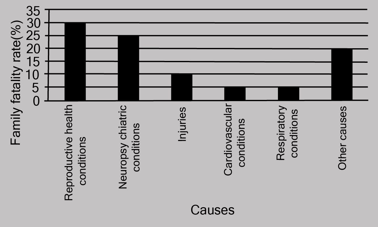
All the rectangle bars are of the same width and have equal spacing between them.
ii. Which condition is the major cause of women’s ill health and death worldwide?
Ans: Reproductive health issues are the leading cause of women's illness and mortality globally, affecting 31.8% of women.
iii. Try to find out, with the help of your teacher, any two factors which play a major role in the cause in (ii) above being the major cause
Ans: The factors are as follows:
a. Lack of medical facilities
b. Lack of correct knowledge of treatment
2. The following data on the number of girls (to the nearest ten) per thousand boys in different sections of Indian society is given below:
i. Represent the information above by a bar graph.
Ans: The graph of the information presented above may be built by choosing an appropriate scale (1 unit = 100 girls for the y-axis) and representing section (variable) on the x-axis and number of girls per thousand boys on the y-axis.
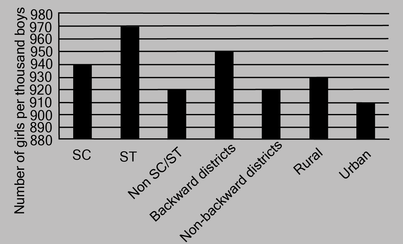
Here, all the rectangle bars are of the same length and have equal spacing in between them.
ii. In the classroom discuss what conclusions can be arrived at from the graph.
Ans: The largest number of females per thousand boys (i.e., 970) is found in ST, while the lowest number of girls per thousand boys (i.e., 910) is found in urban areas.
In addition, the number of females per thousand boys is higher in rural regions than in cities, in backward districts than in non-backward districts, and in SC and ST districts than in non-SC/ST districts.
3. Given below are the seats won by different political parties in the polling outcome of a state assembly elections:
i. Draw a bar graph to represent the polling results.
Ans:
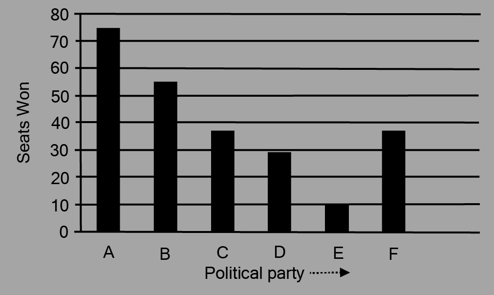
Here, all the rectangle bars are of the same length and have equal spacing in between them.
ii. Which political party won the maximum number of seats?
Ans: From the above graph it is clear that Political party ‘A’ won the maximum number of seats.
4. The length of\[40\] leaves of a plant are measured correct to one millimeter, and the obtained data is represented in the following table:
i. Draw a histogram to represent the given data.
Ans: The length of leaves is represented in a discontinuous class interval with a difference of \[1\] between them, as can be seen. To make the class intervals continuous, \[\dfrac{1}{2} = 0.5\] must be added to each upper class limit and \[0.5\] must be subtracted from the lower class limits.
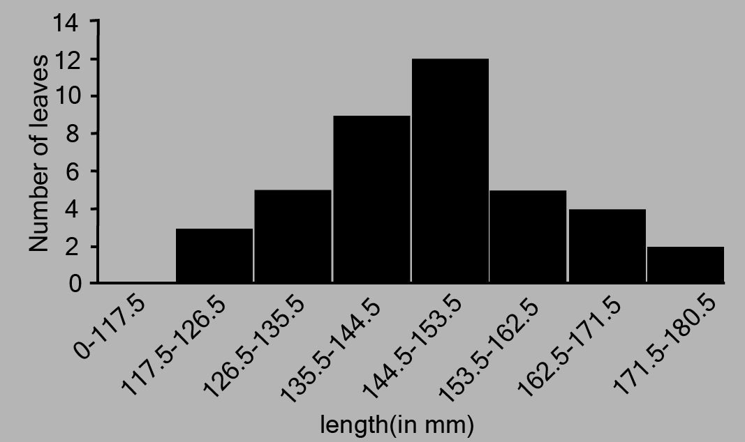
The above histogram may be built using the length of leaves on the x-axis and the number of leaves on the y-axis.
On the y-axis, one unit symbolises two leaves.
ii. Is there any other suitable graphical representation for the same data?
Ans: Frequency polygon is another good graphical representation of this data.
iii. Is it correct to conclude that the maximum number of leaves are 153 mm long? Why?
Ans: No, because the maximum number of leaves (i.e.\[12\]) has a length of \[144.5{\text{mm}}\] to \[153.5{\text{mm}}\] It is not necessary for all of them to be \[153{\text{mm}}\]long.
5. The following table gives the life times of neon lamps:
\[\boxed{\begin{array}{*{20}{c}} {{\text{ Length (in hours) }}}&{{\text{ Number of lamps}}} \\ {300 - 400}&{14} \\ {400 - 500}&{56} \\ {500 - 600}&{60} \\ {600 - 700}&{86} \\ {700 - 800}&{74} \\ {800 - 900}&{62} \\ {900 - 1000}&{48} \\ {}&{} \end{array}}\]
i. Represent the given information with the help of a histogram.
Ans: The histogram of the given data may be produced by plotting the life duration (in hours) of neon lamps on the x-axis and the number of lamps on the y-axis. Here,1
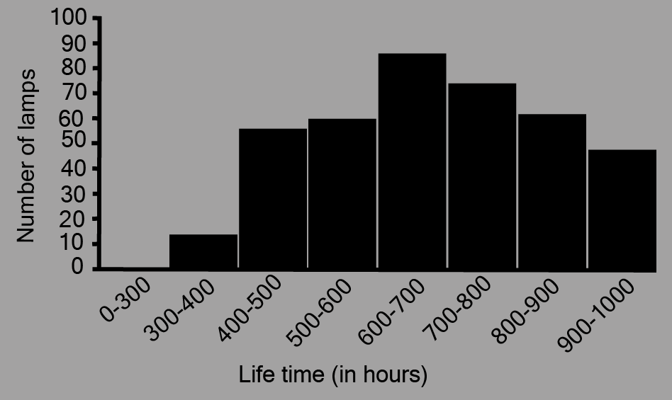
Here, 1 unit on the y-axis represents 10 lamps.
ii. How many lamps have a lifetime of more than \[700\] hours?
Ans: It may be deduced that the number of neon lamps with a lifetime more than \[700\]is equal to the sum of the numbers of neon lamps with lifetimes of \[700,800\]and \[900\]. As a result, there are \[184\] neon bulbs with a lifetime of more than \[700\] hours \[(74 + 62 + 48 = 184)\].
6. The following table gives the distribution of students of two sections according to the mark obtained by them:
Represent the marks of the students of both the sections on the same graph by two frequency polygons. From the two polygons compare the performance of the two sections.
Ans: We can find the class marks of the given class intervals by using the following formula.
\[{\text{Class mark = }}\dfrac{{{\text{Upper class limit + Lower class limit}}}}{2}\]
The frequency polygon can be constructed as follows, with class markings on the x-axis and frequency on the y-axis, and an appropriate scale \[(1{\text{ unit = 3 for the y - axis}})\].
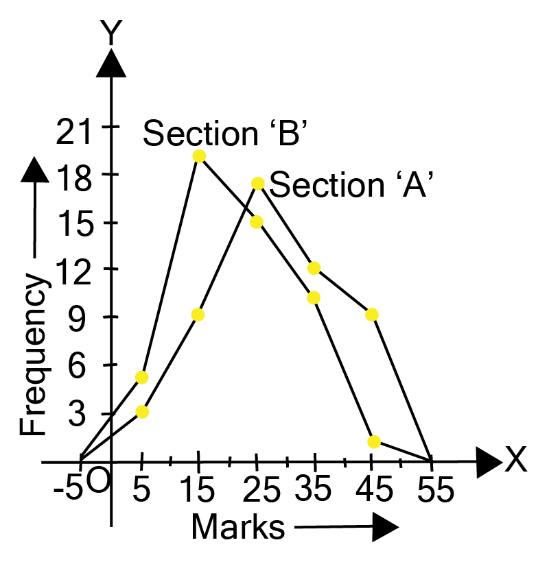
It can be observed that the performance of students of section ‘A’ is better than the students of section ‘B’ in terms of good marks.
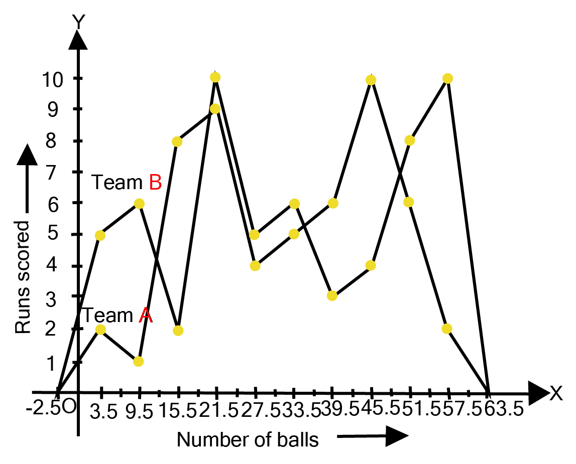
7. The runs scored by two teams A and B on the first 60 balls in a cricket match are given below:
\[\boxed{\begin{array}{*{20}{c}} {{\text{ }}\underline {{\text{Number of balls}}} {\text{ }}}&{{\text{ }}\underline {{\text{Class mark}}} {\text{ }}}&{{\text{ }}\underline {{\text{Team A}}} {\text{ }}}&{{\text{ }}\underline {{\text{Team B}}} {\text{ }}} \\ {0.5 - 6.5}&{3.5}&2&5 \\ {6.5 - 12.5}&{9.5}&1&6 \\ {12.5 - 18.5}&{15.5}&8&2 \\ {18.5 - 24.5}&{21.5}&9&{10} \\ {24.5 - 30.5}&{27.5}&4&5 \\ {30.5 - 36.5}&{33.5}&5&6 \\ {36.5 - 42.5}&{39.5}&6&3 \\ {42.5 - 48.5}&{45.5}&{10}&4 \\ {48.5 - 54.5}&{51.5}&6&8 \\ {54.5 - 60.5}&{57.5}&2&{10} \\ {}&{}&{}&{} \end{array}}\]
Represent the data of both the teams on the same graph by frequency polygons.
(Hint: First make the class intervals continuous.)
Ans: A frequency polygon can be created by plotting class grades on the x-axis and running times on the y-axis.
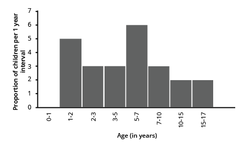
8. A random survey of the number of children of various age groups playing in park was found as follows:
\[\boxed{\begin{array}{*{0}{c}} {\underline {{\text{Age (in years)}}} }&{\underline {{\text{Number of children }}} } \\ {{\text{1 - 2}}}&{\text{5}} \\ {{\text{2 - 3}}}&{\text{3}} \\ {{\text{3 - 5}}}&{\text{6}} \\ {{\text{5 - 7}}}&{{\text{12}}} \\ {{\text{7 - 10}}}&{\text{9}} \\ {{\text{10 - 15}}}&{{\text{10}}} \\ {{\text{15 - 17}}}&{\text{4}} \end{array}}\]
Draw a histogram to represent the data above.
Ans:
9. \[100\] surnames were randomly picked up from a local telephone directory and a frequency distribution of the number of letters in the English alphabet in the surnames was found as follows:
i. Draw a histogram to depict the given information.
Ans:
The histogram can be generated using the number of letters on the x-axis and the fraction of the number of surnames per 2 letters interval on the y-axis, as well as an acceptable scale (1 unit = 4 students for the y axis).
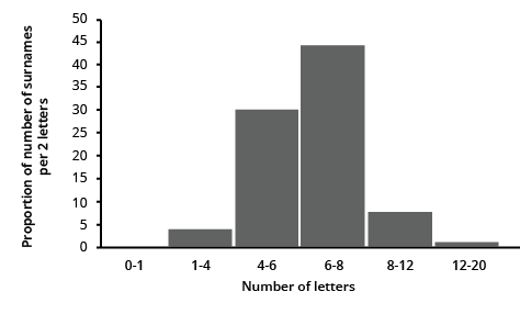
ii. Write the class interval in which the maximum number of surnames lie.
Ans: The maximum number of surnames in the class interval is 6-8 since it contains 44 surnames, which is the maximum for this data.
Overview of Deleted Syllabus for CBSE Class 9 Maths Statistics
Class 9 Maths Chapter 12: Exercises Breakdown
Conclusion
Maths NCERT Class 9 Statistics Chapter has equipped you with valuable tools to transform raw data into meaningful insights. You've explored various methods for data collection and delved into the power of visual representations like bar graphs and histograms. By organizing data into frequency distributions, you've learned to summarize large datasets effectively. Furthermore, you've grasped the significance of central tendency measures (mean, median, mode) in understanding the "typical" value within a data set. In previous years exams, around 2-3 questions have been asked from Class 9 Maths Ch Statistics.
Other Study Material for CBSE Class 9 Maths Chapter 12
Chapter-Specific NCERT Solutions for Class 9 Maths
Given below are the chapter-wise NCERT Solutions for Class 9 Maths. Go through these chapter-wise solutions to be thoroughly familiar with the concepts.
Important Study Materials for CBSE Class 9 Maths


FAQs on NCERT Solutions For Class 9 Maths Chapter 12 Statistics - 2025-26
1. Is a histogram the same as a bar graph in statistics?
No, a histogram is not the same as a bar graph, although both use rectangular bars to display data. The key difference lies in the type of data they represent and the presence of gaps between the bars.
2. Is the range a measure of central tendency like the mean?
No, the range is a measure of spread or dispersion, not central tendency. It tells you how spread out the data is by showing the difference between the highest and lowest values, unlike the mean, which identifies the central point of the data.
3. Do I have to pay to get the statistics class 9 questions and answers PDF?
No, you do not have to pay for the solutions. Reputable educational platforms like Vedantu provide a Free PDF download of the statistics class 9 ncert solutions, making them accessible for all students to use for practice and revision without any cost.
4. Do NCERT Solutions for Class 9 Maths Chapter 12 only provide the final answers?
NCERT Solutions provide complete, step-by-step explanations for every problem, not just the final answer. Many students mistakenly think these are just answer keys, but they are designed as learning tools that guide you through the entire problem-solving process from start to finish.
5. Can a dataset have more than one mode?
Yes, a dataset can absolutely have more than one mode. If two or more values appear with the same highest frequency, the dataset is called bimodal (two modes) or multimodal (more than two modes). A dataset can also have no mode if all values appear only once.
6. Are the class 9 Maths chapter 12 NCERT solutions only useful for checking homework?
No, the class 9 maths chapter 12 NCERT solutions are valuable tools for complete exam preparation, not just for checking homework. The common myth is that their only purpose is to verify answers after you've finished an assignment.
In reality, these solutions are structured to build conceptual clarity. They explain the correct application of formulas for mean and mode and demonstrate the proper method for drawing histograms and frequency polygons, which are common formats in exams.
7. Is primary data always better to use than secondary data?
No, primary data is not always better than secondary data; the best choice depends on the specific investigation's needs. Students often assume that firsthand data (primary) is more reliable, but collecting it can be expensive, time-consuming, and sometimes impossible.
8. Does the NCERT Statistics Class 9 PDF only contain solutions for the main exercise?
No, a good Statistics Class 9 PDF with solutions typically covers more than just the final exercise problems. The misconception is that it's only a key for end-of-chapter questions like the Ex 12.1 Class 9 Statistics solutions.
In fact, detailed solution PDFs also include explanations for the in-text questions and the solved examples presented within the chapter. This ensures you understand concepts as they are introduced, before you attempt the main exercises.
9. Is it enough to just memorize the steps from the NCERT solution class 9 maths chapter 12?
No, simply memorizing steps is not an effective learning strategy. The purpose of the ncert solution class 9 maths chapter 12 is to help you understand the logic behind each step, so you can apply the same concepts to solve different, unseen problems.
10. Is the class mark just the average of any two numbers in a class interval?
No, the class mark is specifically the average of the upper and lower class limits of a single interval. It is not the average of any random numbers. The formula is fixed: Class Mark = (Upper Class Limit + Lower Class Limit) / 2. It represents the precise midpoint of that class.