


Maths Notes for Chapter 13 Smart Charts Class 3 - FREE PDF Download
Smart Charts
The charts by which we can show numerical facts in visual form are known as Smart Charts.
It represents the relationship between two or more numbers or quantities.
There are different types of Charts that such as Tabular Form, Pictograph, Tally Marks, Line charts, Bar charts and Pie charts.
Uses of Charts
To make it easy to understand the large data set and their relationships.
When collected data is represented in charts it's easier and faster to read them than raw data.
Chart concepts are used in a variety of fields.
Data
Collection of information gathered by observations, measurements, research or analysis is known as Data.
Data may consist of facts, numbers, names, figures or even descriptions of things.
Example: Chetan went to the park and collected different flowers for his mother. All flowers collected by Chetan are known as data.
Tabular Chart Form
When the collected data is represented in tabular chart form.
In this chart form, the collected data is represented in tabular form with the different specifications based on the data. Suppose the data is about no. of people travelling in different vehicles. Here specifications will be no. of members and type of vehicles.
Solved Example 1: Krishna collected the data on chocolates that need to be donated to an orphanage from his class and represented them in tabular form.
Data of chocolates: Five star-25, Dairy milk-16, Ferrero Rocher-37, Hershey-48, Toblerone -56.
Ans: Below is the representation data in tabular form
Pictograph
Pictograph, is a type of chart where the data is represented by using pictures.
There are two rules that need to be followed while making the pictograph, there are: i) A pictograph must have a title, ii) The symbol used in the pictograph must be defined.
Solved Example 2: The below board shows the number of students in each class. It also shows the number of students present and absent.
Attendance Board of 21-Mar-2022
Ans: Attendance Board of 21-Mar-2022
Student Absence Chart

Tally Marks
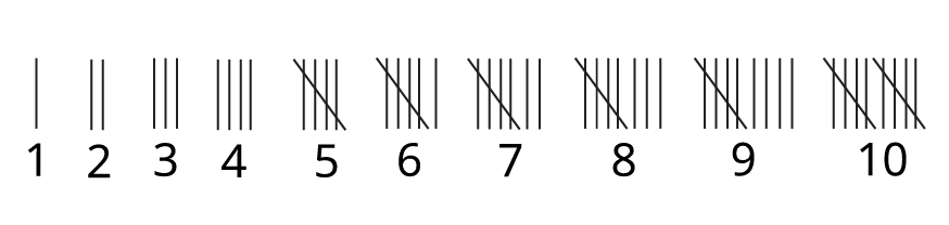
Tally marks are defined in the unary numeral system. It is a form of numeral used for counting.
Representation of Tally Marks: Tally markers are generally written in a group or as a set of five lines. In this group, the first four lines are drawn vertically, and the fifth line goes diagonally over the first four vertical lines, from top to bottom.
Representation of Tally Marks
Solved Example 3: Kanika bought 10 chocolates, 8 packets of biscuits, 3 bottles of juice, 4 packets of fruit cake and 12 toffees and represented the data using tally marks.
Ans: In the below table we represent the data of Kanika using the tally marks.
(Image will be uploaded soon)
Line Chart
A line chart is a chart created by conducting a series of data points together with a line.
It is the most basic chart.
This graph is used to represent information which changes over time.
Solved Example 4: Doctor Ranjan suggested Krish's grandmother eat as many apples as she can because she is weak for at least for 6months. Dr Ranjan also suggested Krish note the no. of apples eaten by her grandmother every month for around 6 months to track her data.
Ans: First we have to make a table and write the data on how many apples were eaten each month for a total of 6months then according to that data we have to represent it on the line graph. To draw a line graph we have to draw one X-axis and one Y-axis. One axis should represent the number of apples and another axis should represent the months.
Below the graph is a line graph that represents the number of apples eaten by Krish's grandmother each month (for 6 months).
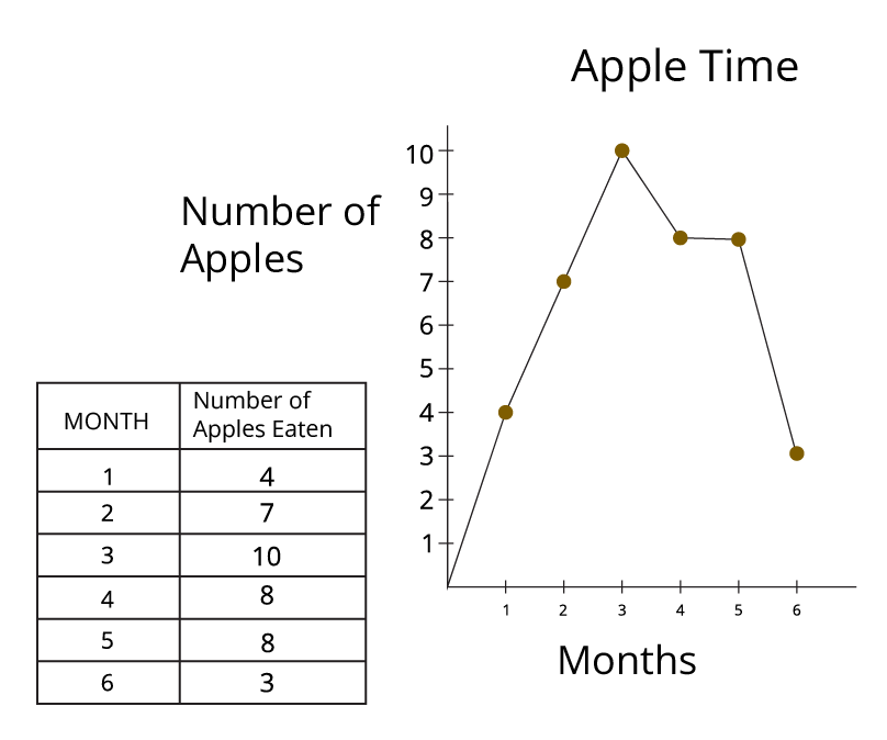
Line graph between No. of apples vs Months
Bar Graph
Bar Graph is a graphical display of data using bars of different heights.
Bar Graphs are divided into two types. They are Vertical Bar Graphs and Horizontal Bar Graphs.
Vertical Bar Graphs: A bar graph or bar chart in which the bars are plotted vertically along the y-axis.
Horizontal Bar Chart: A bar graph or bar chart in which the bars are plotted horizontally along the x-axis.
Solved Example 5: Surya conducted a Survey on how many people consider the below fruits as their favourite fruit: Bananas, Apples, Mangoes, Grapes and Oranges. In the survey, he got the data as mango -20, apple -60, grapes-80, bananas-100 and oranges-45. Represent the above data in both vertical and horizontal bar graphs.
Ans: Below is the vertical bar graph representation of the data of the survey conducted by Surya.
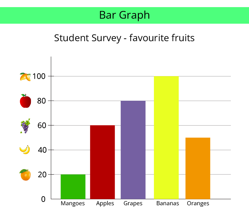
Bar graph between student vs friuts
This is the representation of the above data in the form of a horizontal bar graph.
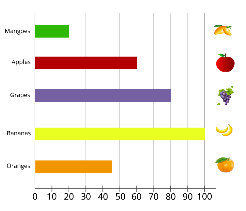
Bar graph between fruits vs No. of student
Circle Chart
It is a type of chart with a shape similar to a round chapati or circle.
A circle Chart is technically known as a Pie chart.
Here the chart is divided into different sections representing a percentage of the total/relative sizes of data.
This is also called a circle or sector graph.
Example: Below pie charts represent the percentage of people who liked the mentioned fruits like apple, banana, orange, kiwi and sweet lemon.
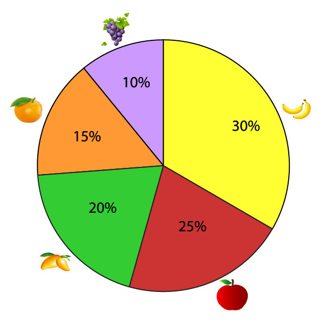
Circle Chart
Practise Problems
1. The given pie chart represents the data of students who want to visit different places. Observe the given pie charts and calculate what percentages of students want to visit museums?
(Image will be uploaded soon)
2. Given the following table shows the most liked breakfast for children.
Answer the following questions on its basis:
i) Which is the most liked breakfast?
ii) Which is the least liked breakfast?
iii) How many children liked both dosa and Idli?
iv) How many children liked only Bread and Jam?
Answers:
1. 49%
2. i) Dosa, ii) Idli, iii) 72, iv) 44
Importance of CBSE Class 3 Chapter 13 Smart Charts
The syllabus of Class 3 Maths is unique in terms of creating a conceptual foundation of various mathematical concepts. The importance of Chapter 13 can be understood from the following points.
Understanding the difference between rows and columns
Creating a conceptual foundation for making tables by including rows and columns
Learning how to figure out information from a given table and answering questions
Perfect way of delivering knowledge with pictures
Reading information from words and pictures simultaneously and answering questions
Understanding the type, similarity, dissimilarity, and eligibility of data in simpler versions to introduce in a particular table
Studying Smart Charts Class 3 will help make students better in thinking logically and solving problems accordingly. It is formulated to create a strong foundation for formulating tables, using data, and extracting information. Hence, the students will be introduced to the basic level of statistics at a young age.
Benefits of Vedantu’s Maths Chart for Class 3 Revision Notes
Now that you have understood the importance of this chapter, here is how Vedantu can deliver the best results with its revision notes and worksheets.
Learning what is Smart Chart
As mentioned earlier, you will learn the definition and use of smart charts for the first time in Class 3. The revision notes for this chapter will be the ideal study material to refer to grab hold of the concept.
Quick Resolution of Doubts
All the doubts rising in your mind can be resolved by using the simpler explanation of concepts in these revision notes.
A basic Introduction to Statistics
Children will also get excellent support in studying these basic concepts related to statistics and other advanced mathematical operations. They will learn how to input data in charts for objects, things, activities such as dice throwing, etc.
Learning to Identify and Differentiate Objects
The revision notes will also help you by getting smart with charts. Learn how to differentiate between various objects and their eligibility.
Getting Smart with Charts Has Become Easier
Download the revision notes today for free and check what do we see on the road. Prepare the answers in the best way possible to save time and score better in the exams. Visit our website to download the PDFs for free and find other related study materials.
Study Materials for CBSE Class 3 Maths

FAQs on CBSE Notes Class 3 Maths Chapter 13 - Smart Charts - 2025-26
1. What are Smart Charts as explained in Class 3 Maths Chapter 13?
Smart Charts are simple and clever ways to show information, also known as data, in a format that is easy to understand. For Class 3 students, this chapter focuses on creating tables, using tally marks to count, and drawing pictographs to make numbers and facts look clear and organised.
2. What is the main purpose of using revision notes for the 'Smart Charts' chapter?
The main purpose of using revision notes for this chapter is to quickly recall the key concepts. These notes summarise how to collect data, how to organise it into a table, and how to represent it using charts. This helps in building a strong foundation for understanding data handling before exams.
3. How are tally marks used to create a smart chart?
Tally marks are a quick method for counting things. In Chapter 13, you learn to represent numbers by drawing vertical lines. Four lines are drawn vertically, and the fifth line is drawn diagonally across them to form a group of five. This system makes it much easier to count larger numbers of items, like different flowers in a garden, when you are putting them into a table.
4. Why is a chart considered "smarter" than just writing down a list of numbers?
A chart is considered "smarter" because it presents information visually. Instead of reading a long list of numbers, you can understand the data at a single glance. For example, in a pictograph, an item with more symbols is instantly recognisable as the most popular one, which is much faster than comparing numbers in a list. This visual summary helps in making quick comparisons.
5. How can I quickly revise the 'Smart Charts' chapter before an exam?
For a quick revision of 'Smart Charts' as per the 2025-26 CBSE syllabus, focus on the following concepts from your notes:
Review the definitions of a chart and a table.
Practise converting simple data collections into a table using tally marks.
Analyse a few pictographs and answer questions based on them, such as identifying the most or least frequent item.
This approach helps in efficiently revising the core skills taught in the chapter.
6. What is a common mistake to avoid when reading a pictograph?
A very common mistake is forgetting to check the key of the pictograph. The key is crucial as it tells you what each symbol or picture represents (for example, one star might equal 5 students). If you only count the symbols without referring to the key, your calculations will be incorrect. Always check the key first to understand the value of each symbol.
7. How do tables and pictographs work together in this chapter?
In Chapter 13, tables and pictographs work together as a team to manage data. First, you collect information and organise it neatly into a table, often using tally marks to count accurately. Next, you use this organised data from the table to draw a pictograph. In this way, the table ensures the data is accurate, while the pictograph makes the data easy and engaging to read and compare.