


What Is a Horizontal Bar Graph and How to Draw It with Examples
Have you heard the term Bar graph horizontal or horizontal bar graph? A horizontal bar graph or bar graph horizontal is nothing but a way to represent data horizontally in a graph using bars. In horizontal bar graphs, we represent data categories on the x-axis whereas data values are on the y-axis. Horizontal bar graphs are generally used to compare different observations. Read the article below to have detailed information on Bar Graph Horizontal with interesting examples.
What is a Bar Graph?
Let us first know what a bar graph is, before knowing the horizontal bar graph in detail.
A bar graph, also known as a bar chart, is a graphical representation of data using bars of different heights.
Imagine you did a survey of 145 people to know which type of fruits are most liked by people.
On the bar graph, we can show this information as:
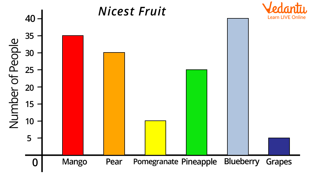
Image: Bar graph of fruits
A bar graph is an optimum way to show relative size. For example, in the above bar graph, we can say blueberries are most liked by the people whereas grapes are least liked by the people.
Types of Bar Graph
There are two different types of bar graphs namely:
Horizontal bar graph and
Vertical bar graph
In this article, we will discuss horizontal bar graphs in detail.
What Does Horizontal Bar Graph Mean?
A horizontal bar graph or bar graph horizontal is a way to represent data horizontally in a graph using bars. In horizontal bar graphs, data categories are represented on the x-axis whereas data values are represented on the y-axis. Horizontal bar graphs are widely used for easy and quick comparison among various observations based on certain parameters. In horizontal bar graphs, the length of the rectangular bars is proportional to their values. Also, all bars in the horizontal bar graph go from left to right.
How to Construct a Horizontal Bar Graph?
Following are the steps to construct a horizontal bar graph:
Step 1: On a graph paper, draw two perpendicular lines intersecting at O.
Step 2: The horizontal line on the bar graph is the x-axis whereas the vertical line on the bar graph is the y-axis.
Step 3: Along a horizontal axis, choose a suitable scale in order to determine the height of the bar for the given values (frequency is represented along the y-axis).
Step 4: Along a vertical axis, choose the uniform width of the bar, and uniform gap between the bars. Also, write the name of the data items whose values are to be marked.
Step 5: Calculate the height of the bar according to the value chosen for each graph and draw the horizontal bars accordingly.
Step 6: Give a suitable title to the graph.
The horizontal bar graph given below gives the information about temperature in celsius on different days of the week.
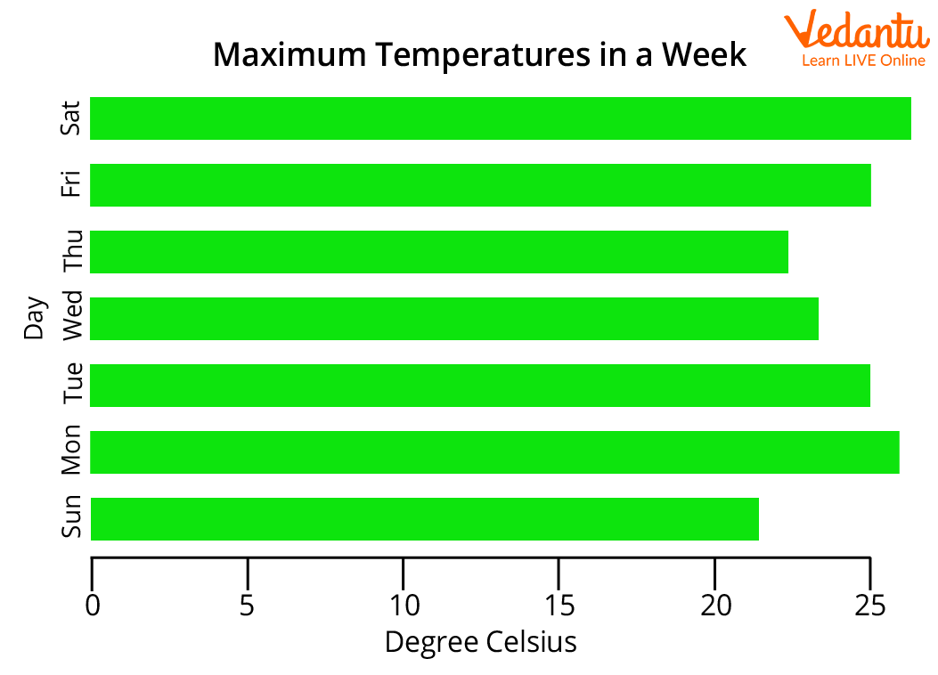
Image: Horizontal bar graph showing maximum temperature in a week
How to Read a Horizontal Bar Graph?
The horizontal bar graph is ead in the following manner:
The title of the bar graph tells about the data being represented by the graph.
The vertical axis of the horizontal bar graph represents the data categories. The data categories in the horizontal bar graph given below are “colours”.
The horizontal axis of the horizontal bar graph represents the values corresponding to each data value. The data values in the below horizontal bar graph represent the number of students who like a particular colour represented on the vertical axis.
The scale is showing the value of 1 unit on the horizontal axis.

Image: Reading horizontal bar graph
From the above horizontal bar graph, we can infer that 1 unit represents 5 students. Accordingly, 10 students like the red colour, 5 students like the yellow colour, 20 students like blue colour, and 15 students like the green colour.
Horizontal Bar Graph Example
Let us understand the horizontal bar graph with an example:
Draw a horizontal bar graph on the basis of the following data.
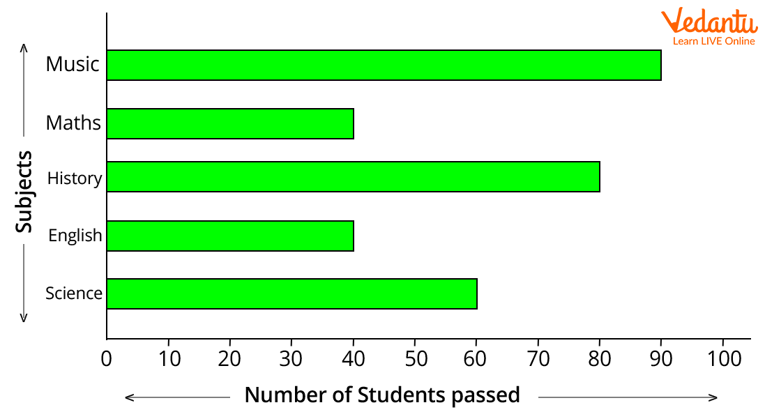
Image: A bar graph showing subjects and the number of students who passed
The horizontal bar graph gives the following information:
The total number of students passed in different subjects.
The maximum number of students passed in Music.
The minimum number of students passed in English and Maths.
Students scored highest marks in Music but scored worst in English and Maths.
Hope you have understood what a horizontal bar graph is, and how to read and represent a horizontal bar graph. Now, you can visit Vedantu’s official website and try different questions based on this to understand the concept better.
FAQs on Horizontal Bar Graph in Maths with Explanation and Uses
1. What is a horizontal bar graph?
A horizontal bar graph is a type of bar chart where rectangular bars are drawn horizontally to represent data values. In this graph:
- The categories are shown on the vertical (y) axis.
- The values or frequencies are shown on the horizontal (x) axis.
- The length of each bar represents the size of the data value.
2. How do you draw a horizontal bar graph step by step?
To draw a horizontal bar graph, follow these steps:
- Step 1: Draw two perpendicular axes (x-axis and y-axis).
- Step 2: Write the categories along the vertical (y) axis.
- Step 3: Choose a suitable scale for the horizontal (x) axis.
- Step 4: Draw horizontal bars according to the data values.
- Step 5: Ensure all bars have equal width and proper spacing.
3. What is the difference between a horizontal and vertical bar graph?
The main difference is the direction in which the bars are drawn. In a horizontal bar graph, bars run left to right, while in a vertical bar graph, bars run bottom to top.
- Horizontal: Categories on y-axis, values on x-axis.
- Vertical: Categories on x-axis, values on y-axis.
- Horizontal graphs are easier to read when category names are long.
4. When should you use a horizontal bar graph?
A horizontal bar graph is best used when comparing categories with long labels or when there are many categories. It is useful when:
- Category names are lengthy.
- You want clear comparison between values.
- The data set has multiple groups.
5. What does the length of the bars represent in a horizontal bar graph?
The length of each bar represents the value or frequency of that category. A longer bar means a larger value, and a shorter bar means a smaller value. For example, if one category has 50 units and another has 30 units, the bar for 50 will extend further along the x-axis.
6. Can you give an example of a horizontal bar graph?
A simple example of a horizontal bar graph is showing the number of students who like different subjects.
- Math: 40 students
- Science: 35 students
- English: 25 students
7. How do you read a horizontal bar graph?
To read a horizontal bar graph, match each category on the y-axis with the length of its bar on the x-axis. Follow these steps:
- Identify the category label.
- Look at where the bar ends on the x-axis scale.
- Read the corresponding value.
8. What scale should be used in a horizontal bar graph?
The scale in a horizontal bar graph should be uniform and appropriate for the data range. For example:
- If values range from 0 to 100, use intervals like 10 or 20.
- If values range from 0 to 20, use intervals like 1, 2, or 5.
9. What are the advantages of a horizontal bar graph?
The main advantages of a horizontal bar graph are clarity and easy comparison of categories. Benefits include:
- Better readability for long labels.
- Clear comparison of data values.
- Simple construction and interpretation.
10. What are common mistakes when drawing a horizontal bar graph?
Common mistakes in a horizontal bar graph include incorrect scaling and unequal bar widths. Avoid these errors:
- Using inconsistent intervals on the x-axis.
- Drawing bars with different thicknesses.
- Not starting the scale from 0 (when required).
- Forgetting to label axes properly.