


How to Draw a Double Bar Graph with Solved Examples and Key Features
The most typical way to depict groups of data in graphs is with a double bar graph. Data from items based on two categories are represented and compared using this method. Typically, bar graphs are covered in the data analysis and interpretation component of competitive exams.To answer the questions one must be able to interpret bar graphs.For practicing double bar graph one could consult double bar graph worksheets.

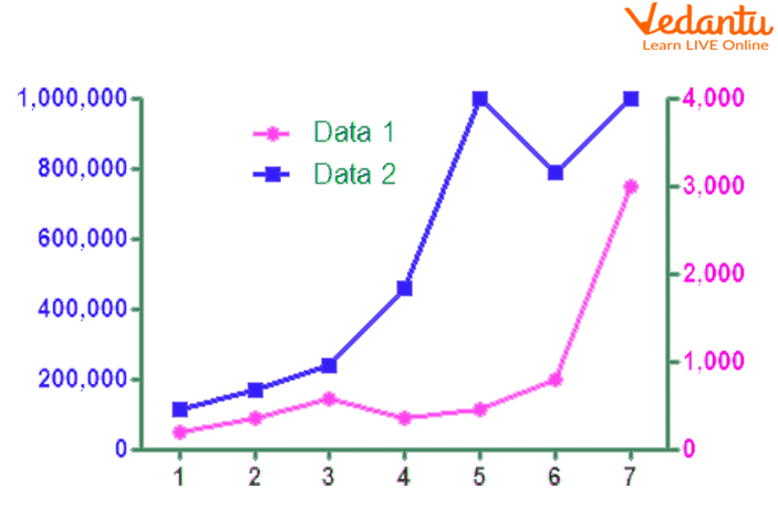
Double Bar Graph
The height of each bar gives information, helping the children notice which columns have more objects and which columns have fewer objects. Bar graphs also help children sort and organize information.
What is a Double Bar Graph?
Double Bar Graph
Bar graphs are a common visual representation. A bar graph is a graphical representation of data that uses lone bars of different heights.
A double bar graph is a visual representation of data that uses two parallel bars of varying heights. You can arrange the bars either vertically or horizontally. A double bar graph can be used to contrast two sets of data to visually compare and contrast between different sets of data using the double bar graph template.
How to Make a Double Bar Graph?
To create a double bar graph, follow these steps:
Make a data-filled table.
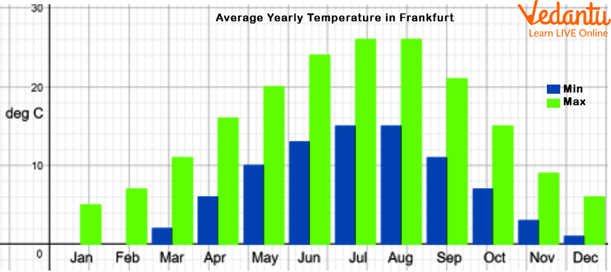
The Frankfurt annual high and low temperatures are shown in this table in degrees Celsius.
To see what kinds of numbers the y-axis should have, determine the range of the data.
The number 26 is the highest value while 0 is the lowest. This graph should be scaled such that 1 unit equals 10 degrees Celsius.
Make a data plot.
Excel or other software programmes can be used to make a double bar graph. On a sheet of paper, it can also be completed manually.
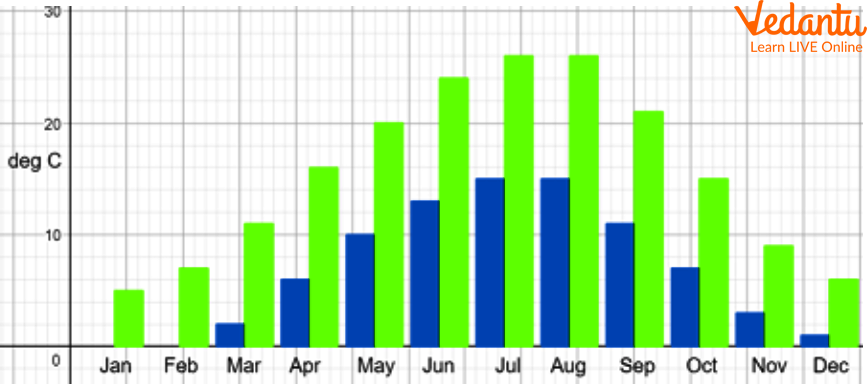
Temperature- Month Bar Graph
Give the x- and y-axes labels.
In this instance, the y-axis displays the temperature in degrees Celsius, and the x-axis displays the yearly months.
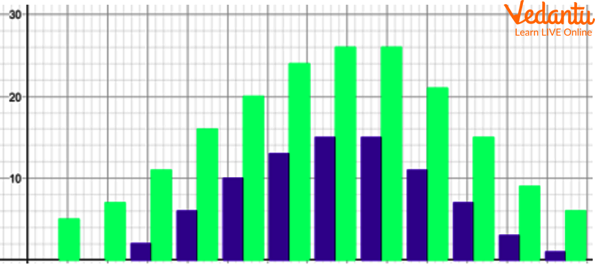
Double Bar Graph
Put a key.
The key here reveals that the highest temperatures are displayed in red and the lowest in green.
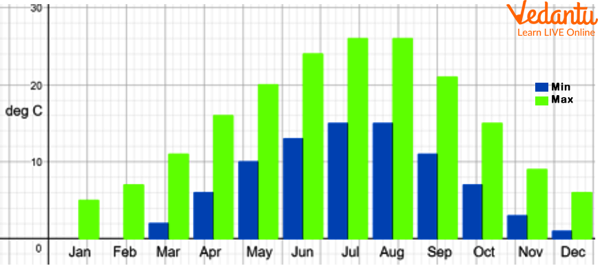
A Double Bar Graph with a Key
Add a heading.
The graph is described in the title.
A Double Bar Graph with Heading
Double Bar Graph Example:

Learning from Examples
Following are the double bar graph example-
Example 1. What sport do girls like to play?
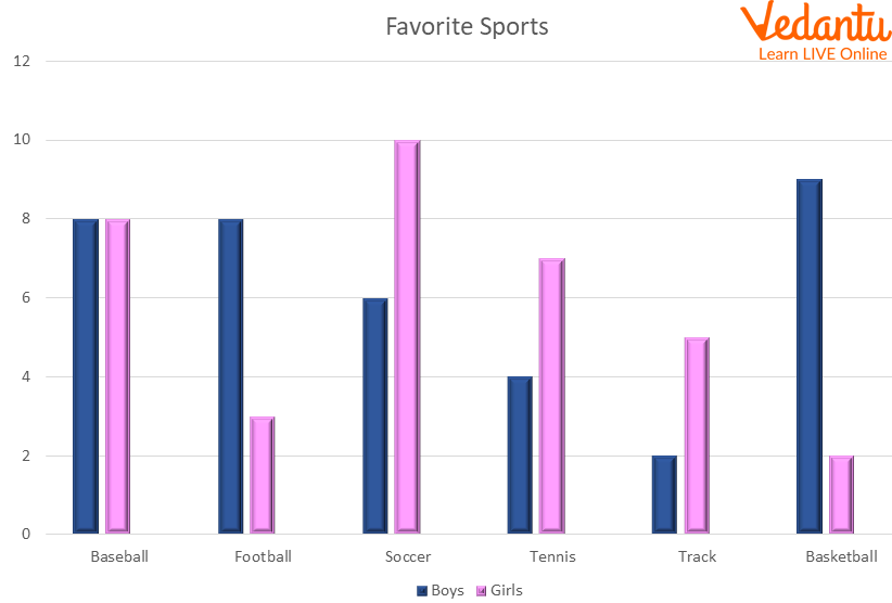
Graph of Favorite Sports
Ans: Look at the graph's pink-colored highest bar. The color of the bar indicates the girls' preferred sports.
Then confirm that the value on the y axis represents the greatest value for any female favorite sport. Soccer is the top choice in this instance with 10 females making that choice, which is also the highest number on the graph of girls' preferred sports.
So, Soccer is the answer.
Example 2. Observe the given graph and answer the questions below.
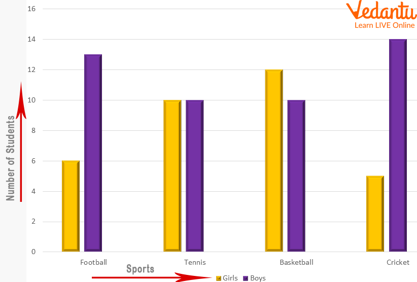
Graph of Sports played by Girls and Boys
1. What sport do girls prefer to play the most?
Ans: Basketball
2. Which sport do boys prefer the most?
Ans: Cricket
Double Bar Graphs Compare Multiple Bar Graph:
Double Bar Graphs Compare Multiple
Let’s see double bar graphs compare multiple bar graph-
Double Bar Graph - A double bar graph is used to display two sets of data on the same graph. We would utilize a double bar graph, for instance, to compare the number of hours that students worked in one month to another.
Multiple Bar Graph - In a bar graph, there may occasionally be more than two sets of data to compare. A multiple bar graph can be utilized in that situation. Any number of data sets can be compared using a multiple bar graph.
Summary
Two sets of data are shown on the same graph using a double bar graph. We would employ a double bar graph, for instance, to compare the number of hours that students worked in one month to another.
The double bar graph worksheets demonstrate how to read a double bar graph to find data and address issues.
FAQs on Double Bar Graph Explained with Definition and Uses
1. What is a double bar graph in maths?
A double bar graph is a type of bar graph that compares two sets of data side by side using pairs of bars for each category. It is used to visually compare two related quantities across the same categories.
Key features of a double bar graph:
- Each category has two adjacent bars.
- Both data sets share the same scale on the vertical axis.
- A legend or key is used to differentiate the two data sets.
2. How do you draw a double bar graph step by step?
To draw a double bar graph, you plot two bars for each category using the same scale. Follow these steps:
- Write the categories on the horizontal (x) axis.
- Mark a suitable scale on the vertical (y) axis.
- Draw two bars side by side for each category.
- Use different colors or shading and add a legend.
- Give the graph a clear title.
3. What is the difference between a bar graph and a double bar graph?
The main difference is that a bar graph represents one data set, while a double bar graph compares two data sets.
Comparison:
- A bar graph has one bar per category.
- A double bar graph has two bars per category.
- A double bar graph requires a legend to distinguish data sets.
4. What are the parts of a double bar graph?
A double bar graph consists of several essential components that help interpret data correctly. These parts include:
- Title – describes what the graph represents.
- X-axis – shows categories.
- Y-axis – shows numerical values.
- Scale – determines intervals on the axis.
- Bars – two bars per category.
- Legend/Key – distinguishes between the two data sets.
5. How do you read a double bar graph?
To read a double bar graph, compare the heights of the two bars in each category using the given scale.
Steps to interpret:
- Identify the category on the x-axis.
- Check the height of both bars.
- Use the scale to determine exact values.
- Compare which bar is taller or shorter.
6. Why do we use a double bar graph?
A double bar graph is used to compare two related data sets clearly and visually. It helps in:
- Identifying differences and similarities between groups.
- Analyzing trends across categories.
- Making quick comparisons in exams and reports.
7. Can you give an example of a double bar graph?
A simple example of a double bar graph is comparing the number of students who like Cricket and Football in four classes.
Example data:
- Class 6: Cricket = 20, Football = 15
- Class 7: Cricket = 25, Football = 18
- Class 8: Cricket = 22, Football = 20
- Class 9: Cricket = 30, Football = 28
8. What scale should be used in a double bar graph?
The scale in a double bar graph should be uniform and suitable for the range of data values.
Guidelines for choosing scale:
- Find the maximum value in the data.
- Choose intervals like 1, 2, 5, 10, etc.
- Ensure the scale covers all values clearly.
9. What are the advantages of a double bar graph?
The main advantage of a double bar graph is that it makes comparison between two data sets simple and visual.
Advantages include:
- Easy side-by-side comparison.
- Clear representation of differences.
- Simple to construct and interpret.
- Useful for reports and presentations.
10. What are common mistakes when drawing a double bar graph?
Common mistakes in a double bar graph include using different scales or forgetting the legend.
Errors to avoid:
- Using unequal scales on the same axis.
- Not labeling the axes properly.
- Forgetting to include a legend/key.
- Drawing bars with unequal width.