


Class 9 Maths Chapter 12 Statistics Exercise 12.1 NCERT Solutions 2025-26: FREE PDF Download
Vedantu offers reliable NCERT Solutions for Class 9 Maths Chapter 12 Statistics Exercise 12.1 to help students practise questions accurately as per the latest CBSE Class 9 Maths syllabus.
 Table of Content
These Class 9 Maths Exercise 12.1 solutions are prepared to support regular practice, answer verification, and proper presentation in examinations. Designed strictly according to NCERT guidelines, the answers follow a clear and structured approach suitable for Class 9 Mathematics learners.
Using these Statistics Exercise 12.1 Class 9 NCERT Solutions, students can build confidence while preparing for school tests and board-level assessments. The availability of a free PDF download allows students to revise exercise 12.1 class 9 questions anytime, even without internet access.
NCERT Solutions For Class 9 Maths Chapter 12 Statistics Exercise 12.1 (2025-26)
1. A survey conducted by an organisation for the cause of illness and death among the women between the ages \[15 - 44\] (in years) worldwide, found the following figures (in %)
i. Represent the information given above graphically.
Ans: The graph of the information presented above can be produced as follows by depicting causes on the x-axis and family fatality rate on the y-axis, and selecting an acceptable scale (1 unit = 5% for the y axis).
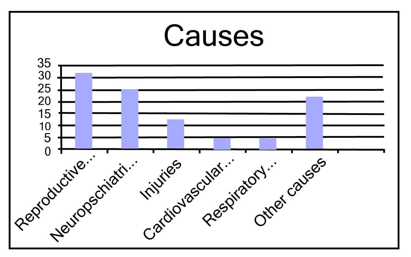
All the rectangle bars are of the same width and have equal spacing between them.
ii. Which condition is the major cause of women’s ill health and death worldwide?
Ans: Reproductive health issues are the leading cause of women's illness and mortality globally, affecting 31.8% of women.
iii. Try to find out, with the help of your teacher, any two factors which play a major role in the cause in (ii) above being the major cause
Ans: The factors are as follows:
a. Lack of medical facilities
b. Lack of correct knowledge of treatment
2. The following data on the number of girls (to the nearest ten) per thousand boys in different sections of Indian society is given below:
i. Represent the information above by a bar graph.
Ans: The graph of the information presented above may be built by choosing an appropriate scale (1 unit = 100 girls for the y-axis) and representing section (variable) on the x-axis and number of girls per thousand boys on the y-axis.
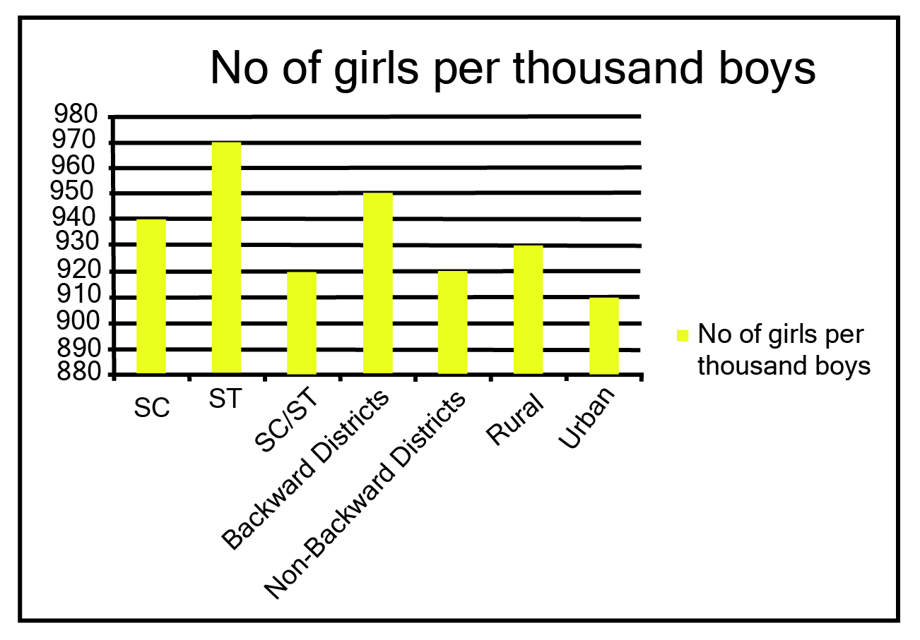
Here, all the rectangle bars are of the same length and have equal spacing in between them.
ii. In the classroom discuss what conclusions can be arrived at from the graph.
Ans: The largest number of females per thousand boys (i.e., 970) is found in ST, while the lowest number of girls per thousand boys (i.e., 910) is found in urban areas.
In addition, the number of females per thousand boys is higher in rural regions than in cities, in backward districts than in non-backward districts, and in SC and ST districts than in non-SC/ST districts.
3. Given below are the seats won by different political parties in the polling outcome of a state assembly elections:
i. Draw a bar graph to represent the polling results.
Ans:
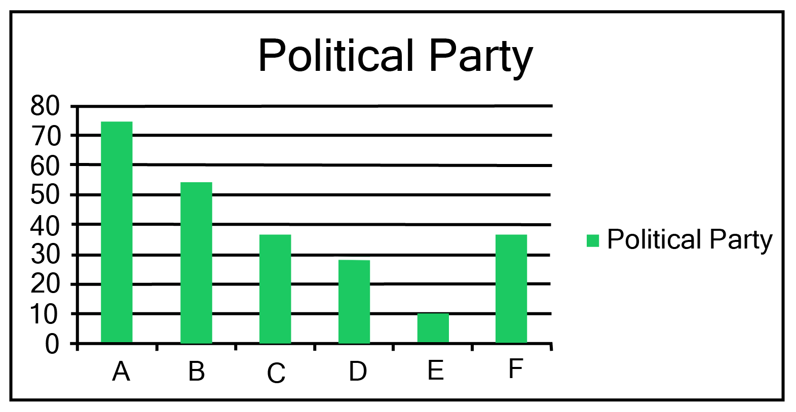
Here, all the rectangle bars are of the same length and have equal spacing in between them.
ii. Which political party won the maximum number of seats?
Ans: From the above graph it is clear that Political party ‘A’ won the maximum number of seats.
4. The length of\[40\] leaves of a plant are measured correct to one millimeter, and the obtained data is represented in the following table:
i. Draw a histogram to represent the given data.
Ans: The length of leaves is represented in a discontinuous class interval with a difference of \[1\] between them, as can be seen. To make the class intervals continuous, \[\dfrac{1}{2} = 0.5\] must be added to each upper class limit and \[0.5\] must be subtracted from the lower class limits.
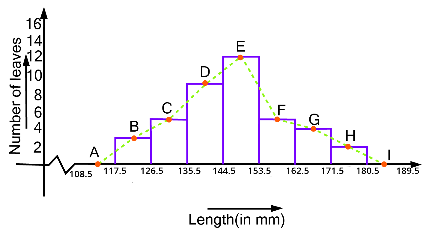
The above histogram may be built using the length of leaves on the x-axis and the number of leaves on the y-axis.
On the y-axis, one unit symbolises two leaves.
ii. Is there any other suitable graphical representation for the same data?
Ans: Frequency polygon is another good graphical representation of this data.
iii. Is it correct to conclude that the maximum number of leaves are 153 mm long? Why?
Ans: No, because the maximum number of leaves (i.e.\[12\]) has a length of \[144.5{\text{mm}}\] to \[153.5{\text{mm}}\] It is not necessary for all of them to be \[153{\text{mm}}\]long.
5. The following table gives the life times of neon lamps:
i. Represent the given information with the help of a histogram.
Ans: The histogram of the given data may be produced by plotting the life duration (in hours) of neon lamps on the x-axis and the number of lamps on the y-axis. Here,1
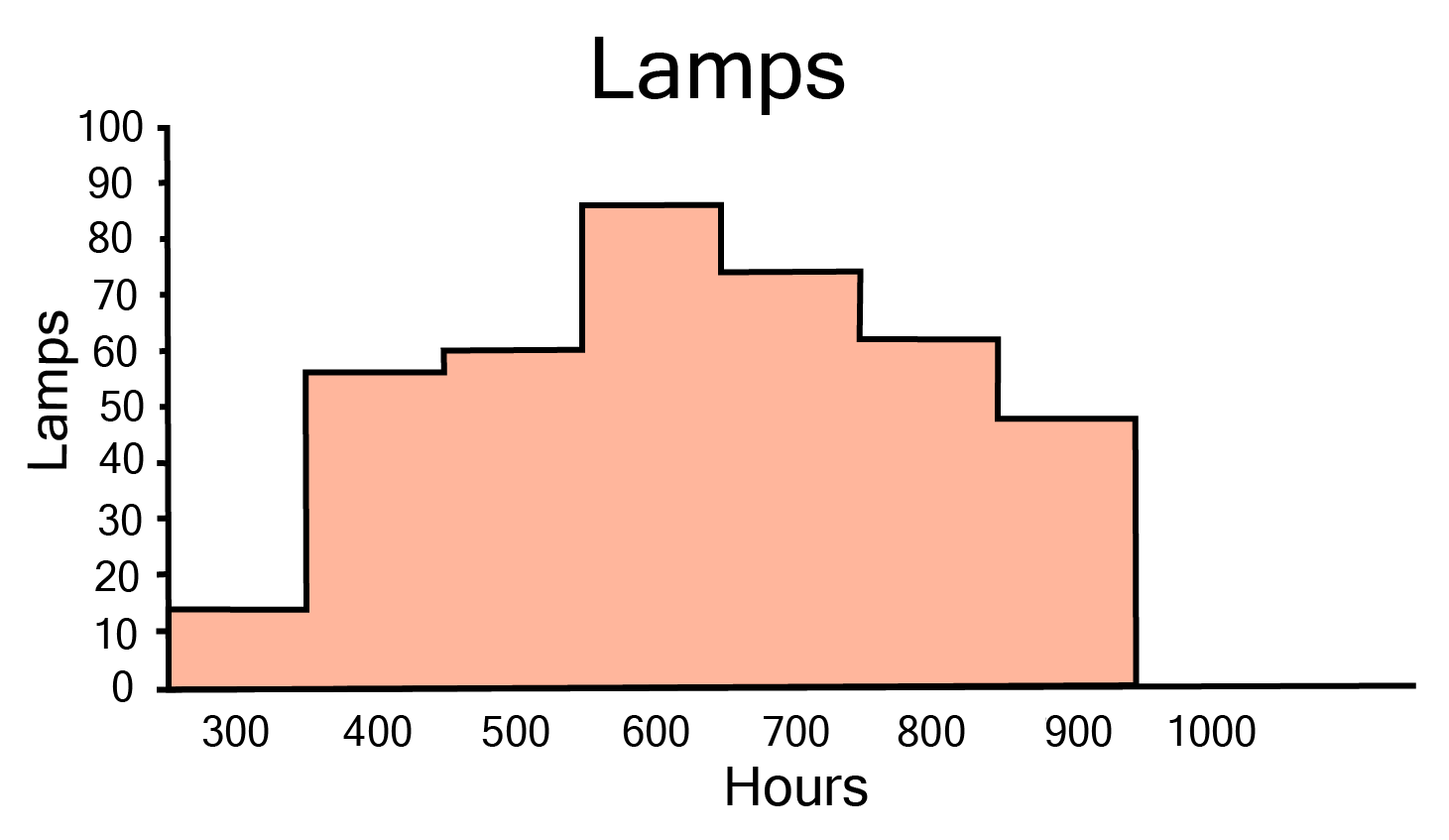
Here, 1 unit on the y-axis represents 10 lamps.
ii. How many lamps have a lifetime of more than \[700\] hours?
Ans: It may be deduced that the number of neon lamps with a lifetime more than \[700\]is equal to the sum of the numbers of neon lamps with lifetimes of \[700,800\]and \[900\]. As a result, there are \[184\] neon bulbs with a lifetime of more than \[700\] hours \[(74 + 62 + 48 = 184)\].
6. The following table gives the distribution of students of two sections according to the mark obtained by them:
Represent the marks of the students of both the sections on the same graph by two frequency polygons. From the two polygons compare the performance of the two sections.
Ans: We can find the class marks of the given class intervals by using the following formula.
\[{\text{Class mark = }}\dfrac{{{\text{Upper class limit + Lower class limit}}}}{2}\]
The frequency polygon can be constructed as follows, with class markings on the x-axis and frequency on the y-axis, and an appropriate scale \[(1{\text{ unit = 3 for the y - axis}})\].
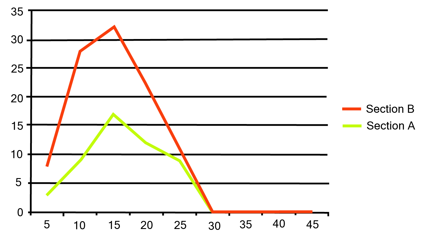
It can be observed that the performance of students of section ‘A’ is better than the students of section ‘B’ in terms of good marks.
7. The runs scored by two teams A and B on the first 60 balls in a cricket match are given below:
Represent the data of both the teams on the same graph by frequency polygons.
(Hint: First make the class intervals continuous.)
Ans: As it can be seen data is not continuous, and the difference in upper limit and
lower limit is 1, so to make class interval continuous 0.5 needed to be added in each
limit.
Class Mark=$(\frac{\text{Upper Limit + Lower Limit} }{\text{2}})$
A frequency polygon can be created by plotting class grades on the x-axis and running times on the y-axis.
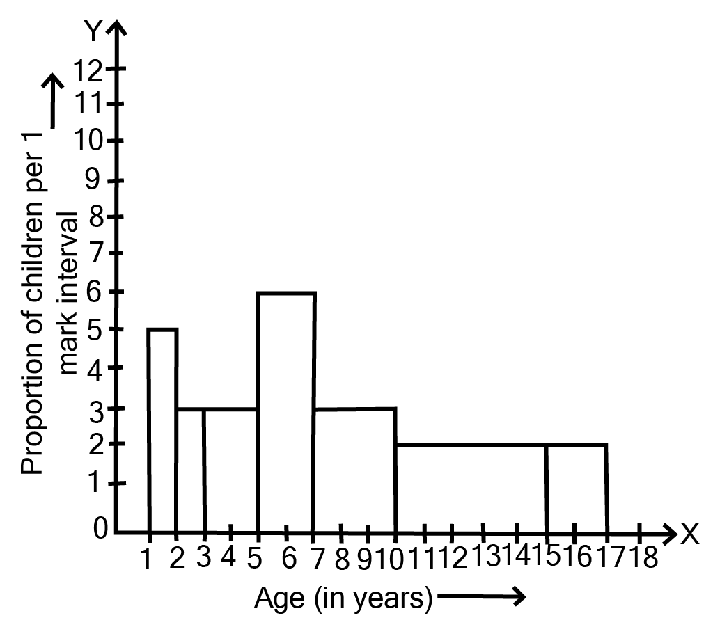
8. A random survey of the number of children of various age groups playing in park was found as follows:
Draw a histogram to represent the data above.
Ans:
9. \[100\] surnames were randomly picked up from a local telephone directory and a frequency distribution of the number of letters in the English alphabet in the surnames was found as follows:
i. Draw a histogram to depict the given information.
Ans:
The histogram can be generated using the number of letters on the x-axis and the fraction of the number of surnames per 2 letters interval on the y-axis, as well as an acceptable scale (1 unit = 4 students for the y axis).
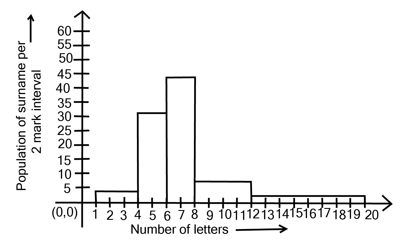
ii. Write the class interval in which the maximum number of surnames lie.
Ans: The maximum number of surnames in the class interval is 6-8 since it contains 44 surnames, which is the maximum for this data.
Conclusion
NCERT Solutions for Statistics Class 9 Exercise 12.1 by Vedantu covers essential concepts such as data collection, organization, and interpretation, including measures of central tendency (mean, median, mode) and graphical representation of data (bar graphs, histograms, frequency polygons). Understanding these concepts is crucial as they form the foundation for more advanced statistical analysis in higher classes. Vedantu's solutions provide step-by-step explanations and practice problems, ensuring that students grasp these fundamental ideas effectively.
CBSE Class 9 Maths Chapter 12 Other Study Materials
Chapter-Specific NCERT Solutions for Class 9 Maths
Given below are the chapter-wise NCERT Solutions for Class 9 Maths. Go through these chapter-wise solutions to be thoroughly familiar with the concepts.
Important Study Materials for CBSE Class 9 Maths


FAQs on NCERT Solutions For Class 9 Maths Chapter 12 Statistics Exercise 12.1 (2025-26)
1. Where can I find Exercise 12.1 Class 9 Maths Statistics solutions?
Exercise 12.1 Class 9 Maths Statistics solutions are available on Vedantu, where all NCERT questions are solved in a clear and structured format.
2. Are the Class 9 Maths Chapter 12 Statistics Exercise 12.1 solutions based on NCERT?
Yes, the Class 9 Maths Chapter 12 Statistics Exercise 12.1 solutions on Vedantu are prepared strictly according to the NCERT textbook.
3. Can I download Exercise 12.1 Class 9 Statistics PDF?
Yes, Exercise 12.1 Class 9 Statistics PDF can be accessed through the NCERT Solutions page on Vedantu for easy reference.
4. Do the Class 9 Statistics Exercise 12.1 solutions include all textbook questions?
Yes, the Class 9 Statistics Exercise 12.1 solutions on Vedantu include answers to all questions given in the NCERT exercise.
5. Are Ex 12.1 Class 9 Maths Statistics solutions useful for homework?
Yes, Ex 12.1 Class 9 Maths Statistics solutions on Vedantu are suitable for homework as they follow NCERT answer format.
6. Do the Class 9 Maths Chapter 12 Statistics Exercise 12.1 answers show steps clearly?
Yes, the Class 9 Maths Chapter 12 Statistics Exercise 12.1 answers on Vedantu show step-by-step working as expected in school exams.
7. Are the 12.1 Class 9 Statistics solutions aligned with the latest syllabus?
Yes, the 12.1 Class 9 Statistics solutions on Vedantu are aligned with the latest NCERT and CBSE syllabus.
8. Can private candidates use Class 9 Maths Statistics Exercise 12.1 solutions?
Yes, private candidates following the NCERT curriculum can use Class 9 Maths Statistics Exercise 12.1 solutions available on Vedantu.
9. Are Class 9 Maths Chapter 12 Statistics Exercise 12.1 solutions suitable for school tests?
Yes, the Class 9 Maths Chapter 12 Statistics Exercise 12.1 solutions on Vedantu are written in an exam-appropriate format suitable for school tests.
10. Which website provides clear NCERT Solutions for Class 9 Maths Statistics Exercise 12.1?
Vedantu provides clear and well-structured NCERT Solutions for Class 9 Maths Chapter 12 Statistics Exercise 12.1.