


What is a Line Graph Definition Formula and How to Draw
The graph of x and y-axis also referred to as the graph x and y axis, are two crucial lines in the 2-D plane. A graph can represent data on both the horizontal and vertical axes. A graph makes it simple to understand how a point might be defined vertically or horizontally.
A graphical depiction of data requires the X- and Y-axis. The coordinate plane is made up of these axes. The information is positioned in coordinates based on how far it is from the X- and Y-axes. Complicated equations can be solved more easily using graphics.
To better understand, let's learn more about the line graph x and y axis in Mathematics, the table, the charts, and answer a few cases.
Definition for Line Graph x and y Axis
The two axes, the x-axis, and the y-axis, that makes up a graph's coordinate plane can be used to define a graph x and y-axis. The x-axis and y-axis stand in for the horizontal and vertical axes.
The origin, which serves as the plane's referencing point, is where the x and y axes cross.
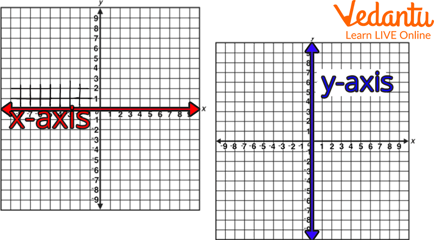
X and Y Axis
The graph of the x-axis or graph of x is also referred to as the abscissa. The graph of the y-axis is also referred to as the ordinate. Any point on the coordinate plane is well defined by an ordered pair, which is written as (x-coordinate,y-coordinate) or (x,y), where x-coordinate denotes a point on the x-axis or at a perpendicular angle from the y-axis and y-coordinate denotes a point on the y-axis or at a perpendicular angle from the x-axis.
Each perpendicular line in an x and y graph represents one of the four quadrants with positive and negative coordinates.
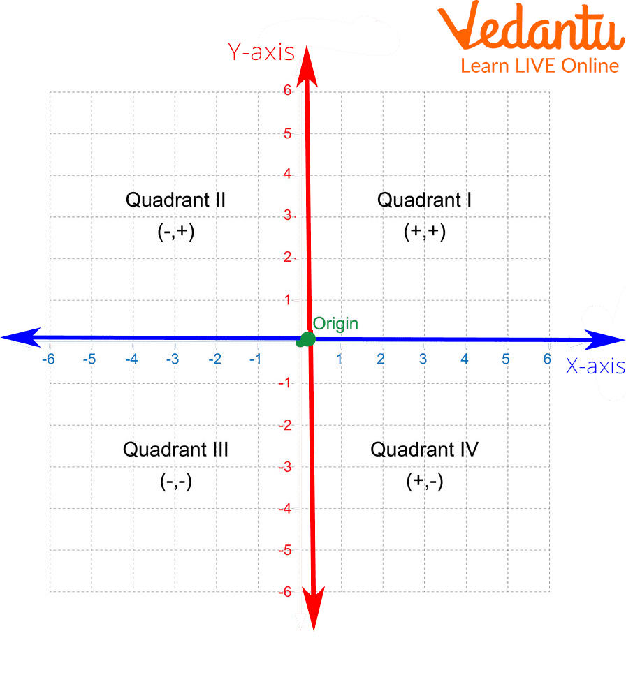
Quadrants in a Graph
Example: Number of minutes of commercials in one hour of television since 2009-
We use an ordered pair to find any point on the coordinate plane. The ordered pair is written as (x-coordinate,y-coordinate) or (x, y), where x-coordinate denotes a point on the x-axis or perpendicular distance from the y-axis and y-coordinate denotes a point on the y-axis or perpendicular distance from the graph of x-axis.
As we can see, each point's location on the graph is indicated by an ordered pair, with the x-axis or x-coordinate coming first and the y-axis or y-coordinate coming second. Using years as the x-axis and the number of minutes of commercials in one hour of television as the y-axis, depict these points as follows on the x and y chart.
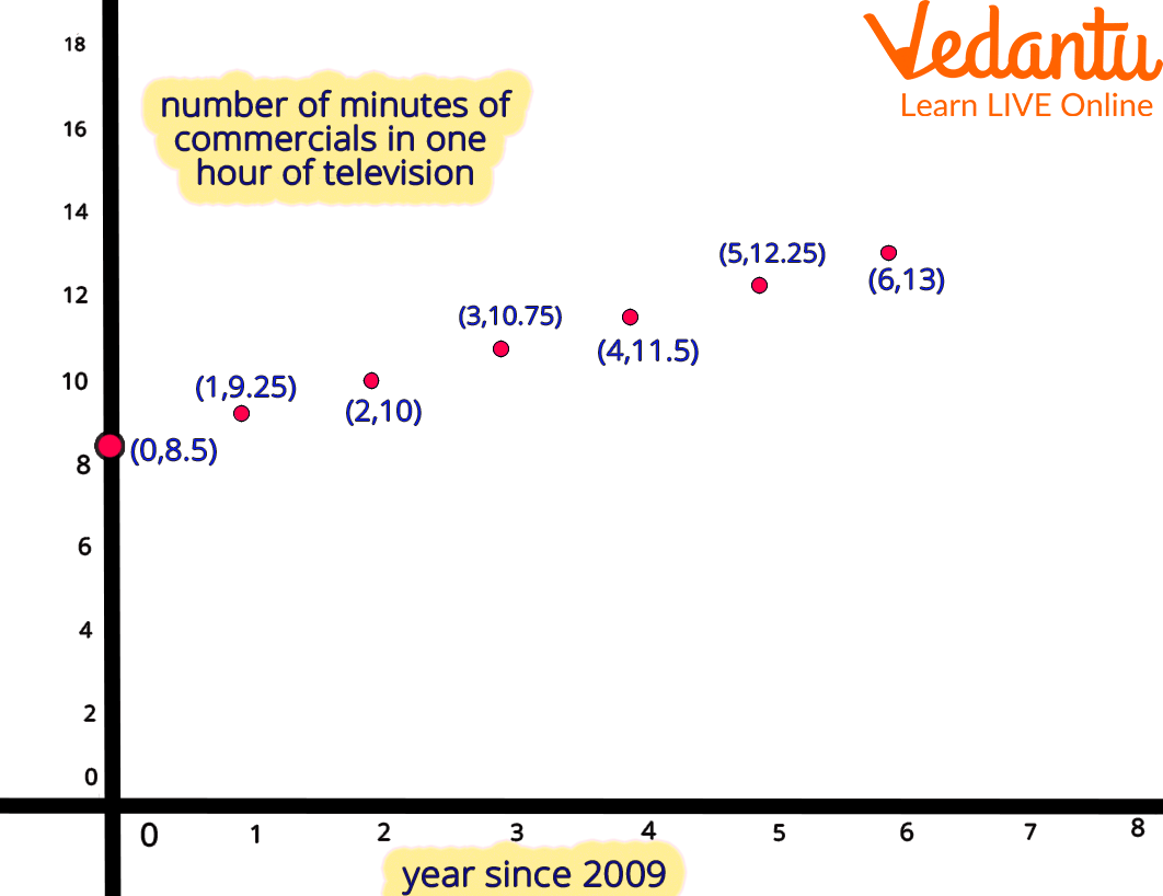
Example of X and Y Graph
Line Graph- x and y-axis
A horizontal x-axis and a vertical y-axis make up the line graph. These axes often cross around the bottom of the y-axis and the left end of the x-axis because the majority of line graphs only deal with positive numerical values. The intersection of the axes is always at (0,0). A data type is listed next to each axis. The x-axis could represent days, weeks, quarters, or years, for instance, while the y-axis displays revenue in dollars.
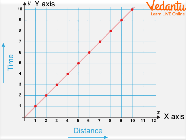
Line Graph with X and Y-axis
Graph of Relation (Relation Graph)
The set of all points (x, y) in a coordinate plane such that x is related to y by the relation R is known as the graph of a relation R. It is possible to graph a relation (relation graph) made up of infinitely many ordered pairs of numbers using just point plotting.
Illustration: The given diagram shows a relation graph.
$R=\{(2,5),(4,3),(6,1),(2,7)\}$
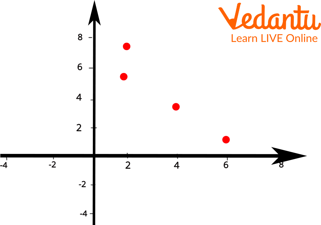
Relation Graph
Solved Examples
Q 1. Draw a line graph to represent the data from the table.
Ans:
Q 2. A number of weeks vs rainfall. Plot the graph from the given data
Week- 1 2 3 4 5
Rainfall - 23 21 17 19 24
Ans:

Practice Problems
Q 1. Plot a line graph from the given data of x and y respectively.
Q 2. Draw the line graph showing the following table.
Q 3. Draw the line graph:
Summary
A line graph has two axes: a horizontal x-axis and a vertical y-axis (vertical). The sites where the axes connect each indicate a distinct type of data, and (0, 0). Because its values are independent of any variables being measured, the x-axis is known as the independent axis. In the given article we have discussed the X and Y graphs. Definition of X and Y graphs and graph x and y-axis are given with the graph of relation in this article.
FAQs on Line Graph in Maths Complete Guide with Examples
1. What is a line graph in Maths?
A line graph is a graphical representation of data that shows how values change over time or across continuous intervals. It is created by plotting data points on a coordinate plane and connecting them with straight line segments.
- The horizontal axis (x-axis) usually shows time or independent values.
- The vertical axis (y-axis) shows the dependent variable.
- It is mainly used to show trends, patterns, and changes in data.
2. How do you draw a line graph step by step?
To draw a line graph, plot the data points on a coordinate plane and join them with straight lines. Follow these steps:
- Draw the x-axis (horizontal) and y-axis (vertical).
- Label both axes with the correct variables and units.
- Choose a suitable scale for each axis.
- Plot each data pair (x, y) accurately.
- Connect the plotted points with straight line segments.
3. What is the difference between a line graph and a bar graph?
The main difference is that a line graph shows continuous change, while a bar graph compares discrete categories.
- A line graph connects data points with lines to show trends over time.
- A bar graph uses rectangular bars to compare separate groups or categories.
- Line graphs are best for time series data.
- Bar graphs are best for comparing quantities across different groups.
4. What are the parts of a line graph?
The main parts of a line graph are the axes, scale, data points, and line segments. These include:
- X-axis: shows the independent variable (often time).
- Y-axis: shows the dependent variable.
- Scale: consistent intervals used for measurement.
- Data points: plotted coordinates (x, y).
- Line segments: connect points to show trends.
- Title and labels for clarity.
5. How do you interpret a line graph?
To interpret a line graph, analyze the direction and slope of the line to understand trends and changes.
- An upward slope indicates an increase.
- A downward slope indicates a decrease.
- A flat line shows no change.
- Steeper lines indicate faster rates of change.
6. What is the slope in a line graph?
The slope in a line graph measures the rate of change between two points. It is calculated using the formula slope = (y₂ − y₁) / (x₂ − x₁).
- If slope > 0, the graph rises.
- If slope < 0, the graph falls.
- If slope = 0, the graph is horizontal.
7. When should you use a line graph?
A line graph should be used when you want to show trends or continuous changes over time. It is ideal for:
- Tracking growth or decline (e.g., temperature changes).
- Comparing data over equal intervals.
- Analyzing patterns in time series data.
8. Can you give an example of a line graph question with solution?
Yes, a typical line graph problem involves plotting and interpreting time-based data. Example: The number of books read over 4 months is 2, 4, 6, and 8.
- Plot months (1,2,3,4) on the x-axis.
- Plot books (2,4,6,8) on the y-axis.
- Join the points to form a line.
9. What are common mistakes when drawing a line graph?
Common mistakes when drawing a line graph include incorrect scaling and improper labeling. Avoid these errors:
- Using uneven or inconsistent scales.
- Not labeling axes or units correctly.
- Plotting points inaccurately.
- Connecting unrelated categories with lines.
10. What is the formula used in a line graph equation?
The equation of a straight line shown in a line graph is commonly written as y = mx + c, where m is the slope and c is the y-intercept.
- m represents the rate of change.
- c represents the value of y when x = 0.